Viceland

It’s a TV channel
–
Culture at the intersection of high and low.
With a focus on global lifestyle and culture, the network’s original content slices across the cultural spectrum: food, sex, fashion, music, sports, politics and more.
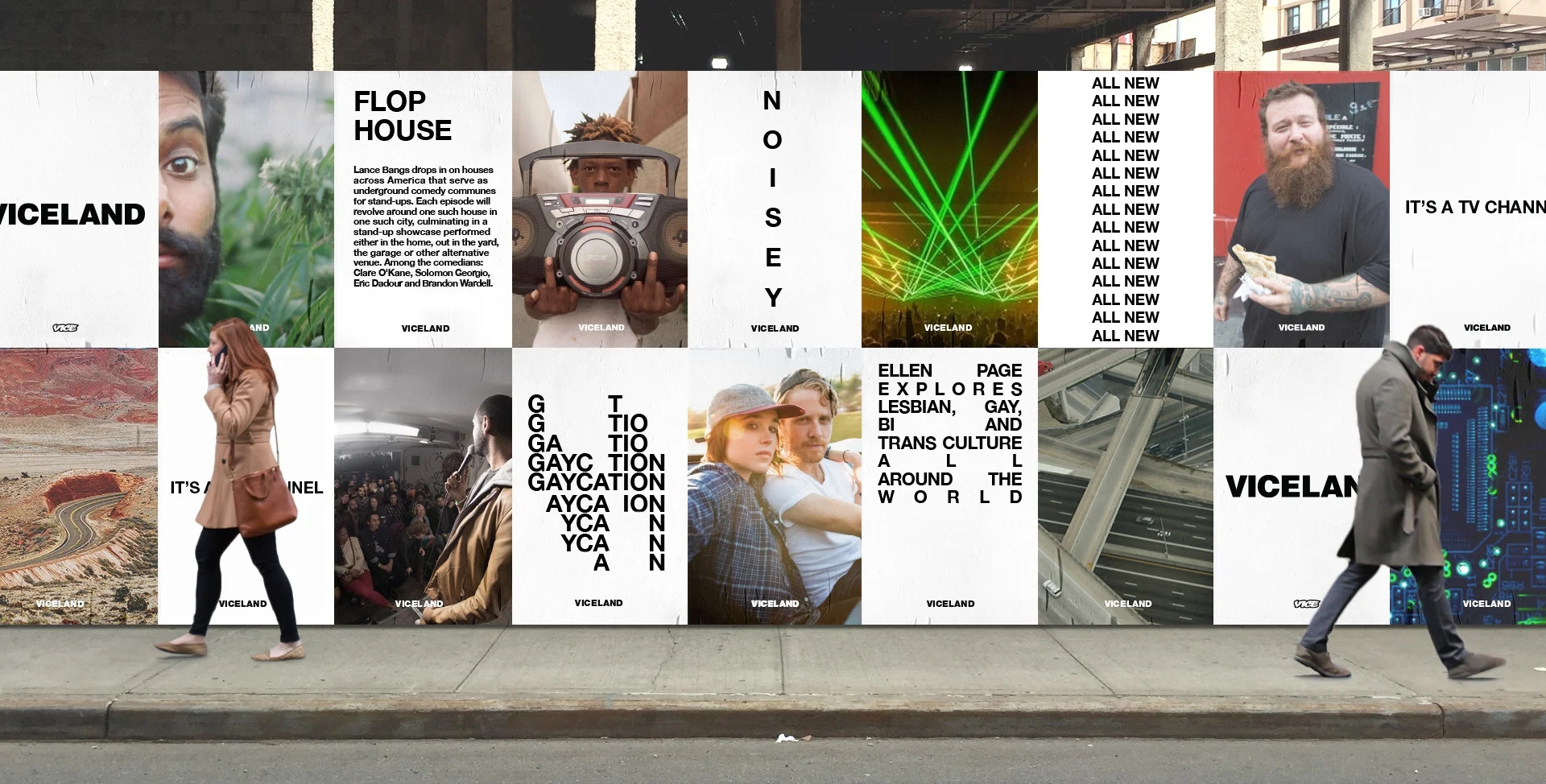
The VICELAND brand is equal parts exhibition catalog and street flyer; Craigslist and couture; generic and refined. It is simultaneously the elevated “high” and vernacular “low.”
A translation of the VICE sensibility, it’s blunt and raw – an exposed structure, a functional language free of decoration, artifice and veneer. The brand is an objective frame for the network’s content. Unstyled, unslick, unadorned.


The Unbrand
–
The basic ingredients combine in different proportions to modulate the VICELAND expressions. Content falls under one of three types: smart and curious, light and fun, or deep and dangerous.
The objective, null design brings the personalities, content and tone of each show to the foreground while allowing for diversity in composition and messaging and smooth translation to any platform.
Different topics are navigated by individual hosts, each with unique perspectives. Their personalities, where they choose to go, the people with whom they interact and the raw, unpolished moments that they capture make up the essence of VICELAND.


D&AD Awards: Yellow Pencil, Graphite Pencil.

Empathy & Emotion
–
Spike Jonze (VICE Creative Director) and Eddy Moretti (VICE Chief Creative Officer) tasked us with creating a transparent and empathetic brand. A voice and design that could punctuate, counterpoint, inform and, whenever possible, step back. A range of emotion and the impact of the images had to pass through the brand undiluted.
Because the programming is developed, produced and promoted almost entirely under one roof, everything is naturally steeped in the VICE sensibility. Therefore, the branding didn’t need to impose a visual or tonal super-structure to unify disparate voices. The challenge was to craft a brand that could express its own voice through the content.
Vernacular Behavior
–
VICELAND is made by and for people who are curious about the world at large. The brand borrows more than just visual cues from populist, vernacular design. It also functions as a service. It can point viewers to cultural events, emerging artists and topical facts, and even promote local goods and services for sale – all in the interest of pointing the viewer out into the world.


Type Directors Club:
Winner & Judge’s Choice.


Unmotion
–
The way VICELAND behaves in motion is an extension of the default aesthetic. It’s ASCII, text-edit, HTML 1. No effects, no techniques – the animation is deliberately basic and throws the focus back to the content. The entire brand is built on two core moves: hard cuts and linear slides.

These can be used alone or compounded to create blinks, reveals, ripples, stretches and waves. The irony of such a low-tech, analog approach is that it can easily adapt to virtually any contemporary platform with the most fundamental tools.


Brand Zines
–
Brand guidelines took the form of a series of printed pamphlets, each focusing on one key aspect of the brand. Usage is demonstrated through examples, references and writing. The brand guides articulate how the VICELAND personality translates into language, design, motion and editorial structure.


