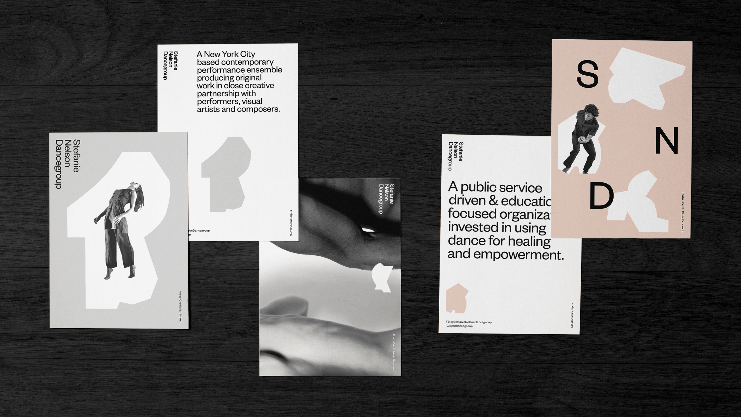
Stefanie Nelson Dancegroup
The Geometry
of Movement
–
Expressing dance through
a dynamic visual language
Moving into their 20th anniversary, Stefanie Nelson Dancegroup needed an identity that more strongly embodied the character and energy of the brand. Known for thought-provoking choreography that draws on Nelson’s unique approach to awkward, contorted and ambiguous movement, SND’s work is edgy, visceral and strikingly visual.
The Forms
–
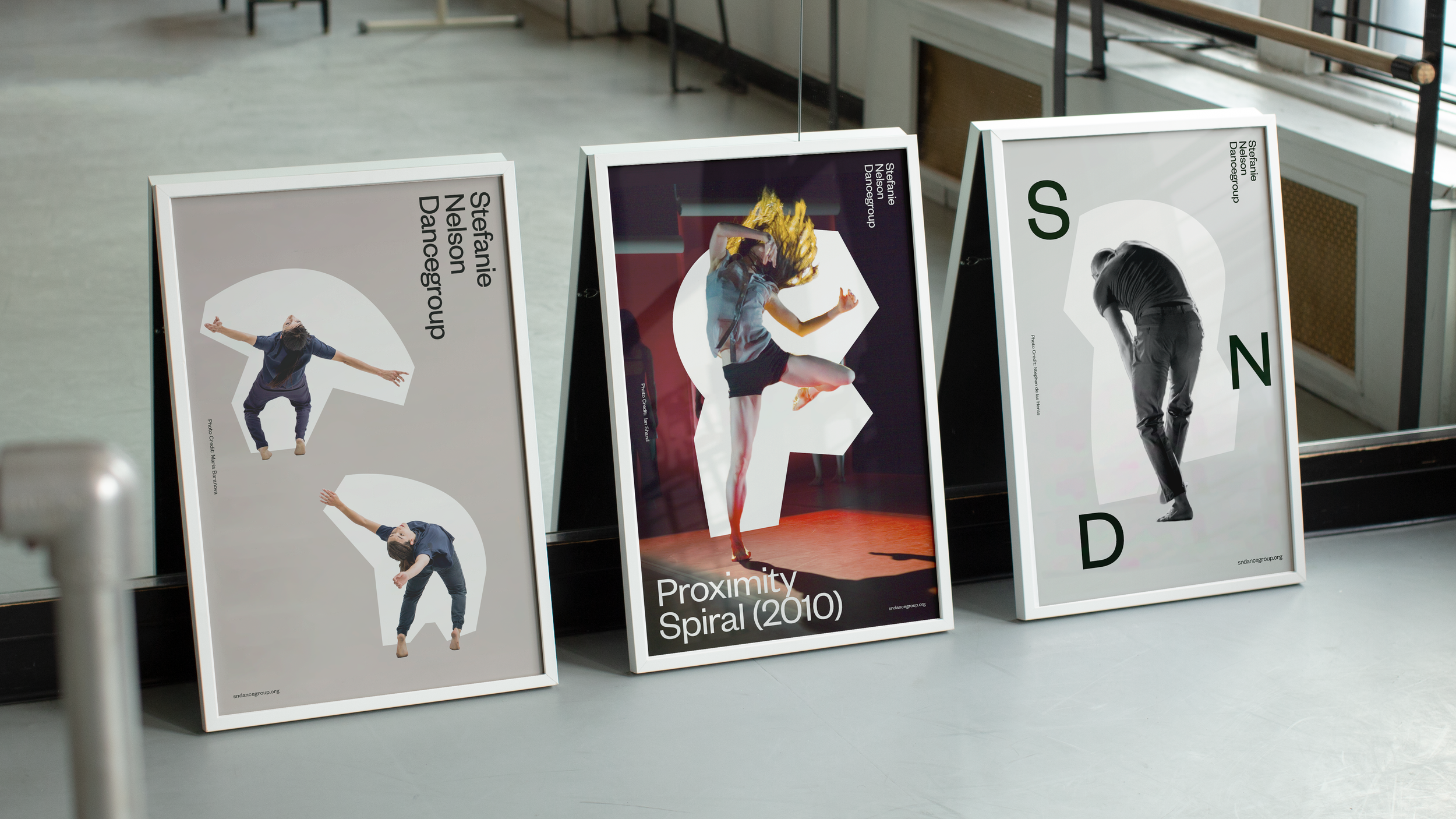
To capture this spirit we explored graphic shapes that allow for bold assertions of movement and physical form. The geometric language serves as a library of bodily abstractions that can express and suggest movement in a way that feels spontaneous but grounded, instinctive but intentional. These gestures now serve as totems for the company.
The Mark
–
The SND monogram echoes the geometry of movement. Never seen the same way twice, the letters are meant to interact and respond to the photography, circling and interacting with the subjects the way other dancers would in the space. As a counter balance, the full logo resolves in a state of rest and quiet.
Identity
–


"It's fresh but classic, flexible but singular, and offers a brilliant blueprint for how a cultural organisation's work can be translated into smart, adaptable design and branding systems."

Extended into kinetic compositions with typography and text layout, the brand system reflects the minimalist idiosyncratic spirit of the performance ensemble.


D&AD Awards:
Wood Pencil

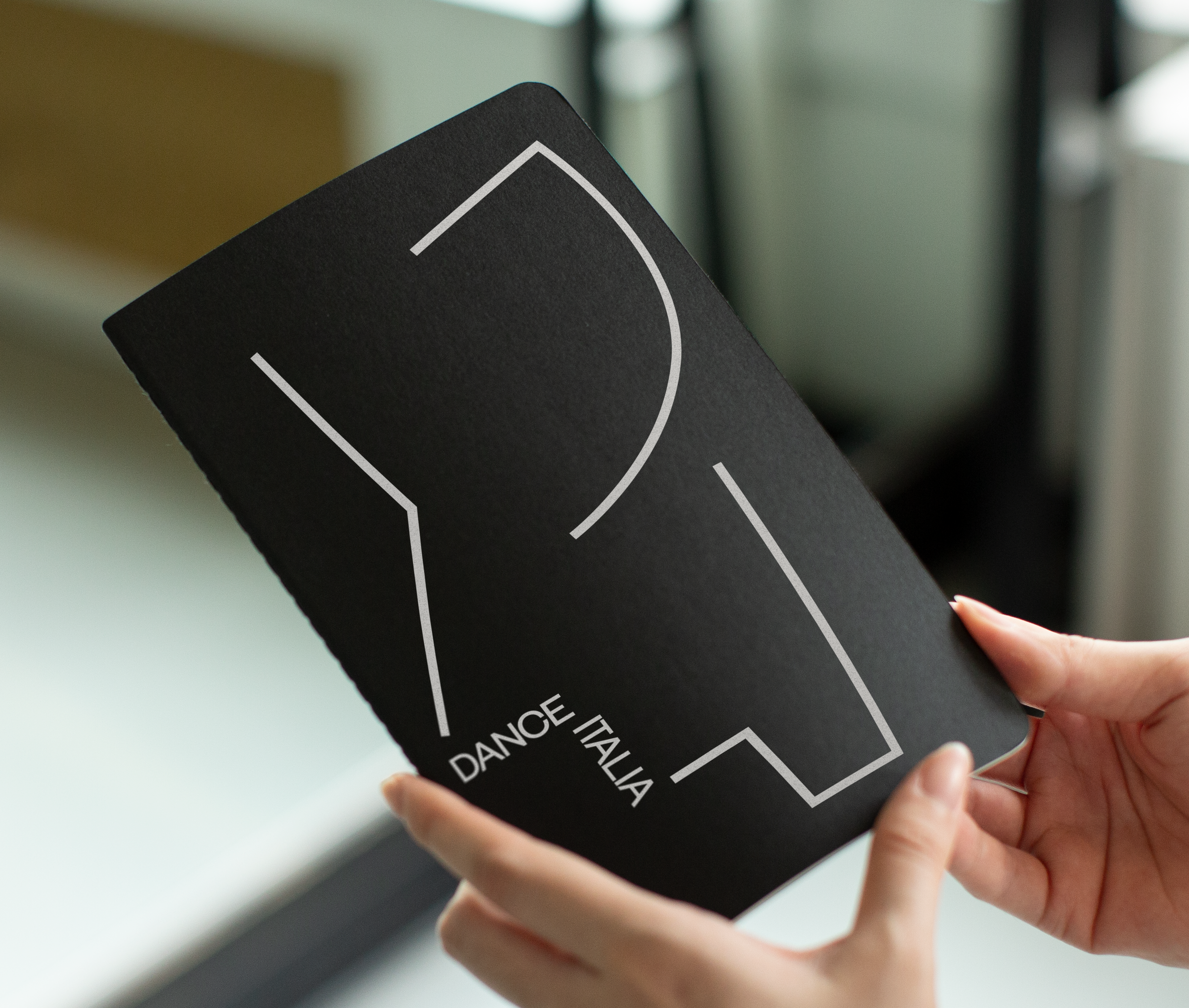
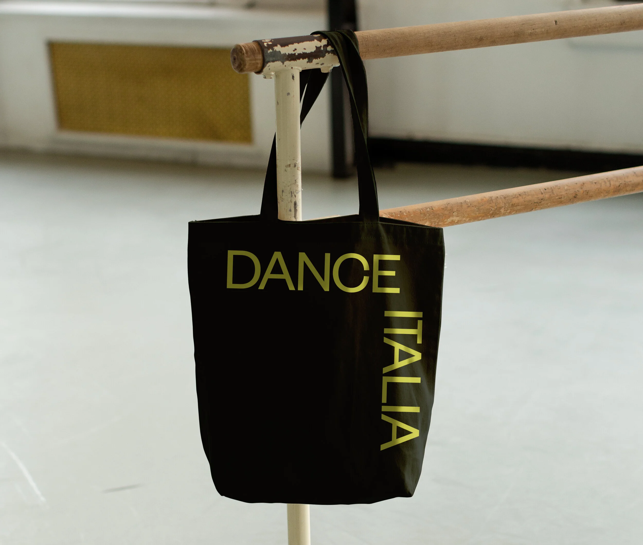
Dance
Italia
–
Dance Italia is a summer program founded by Nelson in 2011 and a sub-brand of SND. While both speak the same geometric language, DI uses the shapes as outlines and disjointed segments that add to the kinetic feel. The vibrant palette skews younger, decidedly more adventurous than the parent.