NI
Engineer
Ambitiously
–
Revealing the human side of precision technology
For 40 years, National Instruments has been a leader in test and measurement, fostering a devoted community of engineers that work to power the world’s most groundbreaking technologies and innovations. National Instruments needed to evolve their brand to reflect their business, which had shifted focus toward integrated hardware and software systems over individual products.
To continue to grow globally, the brand needed to speak to the needs of larger enterprises while remaining true to the community of passionate and brilliant engineers they’ve always served. To further modernize and globalize the brand, and to represent the company’s true breadth of offerings, we shifted the brand name to simply: NI.
Identity
–
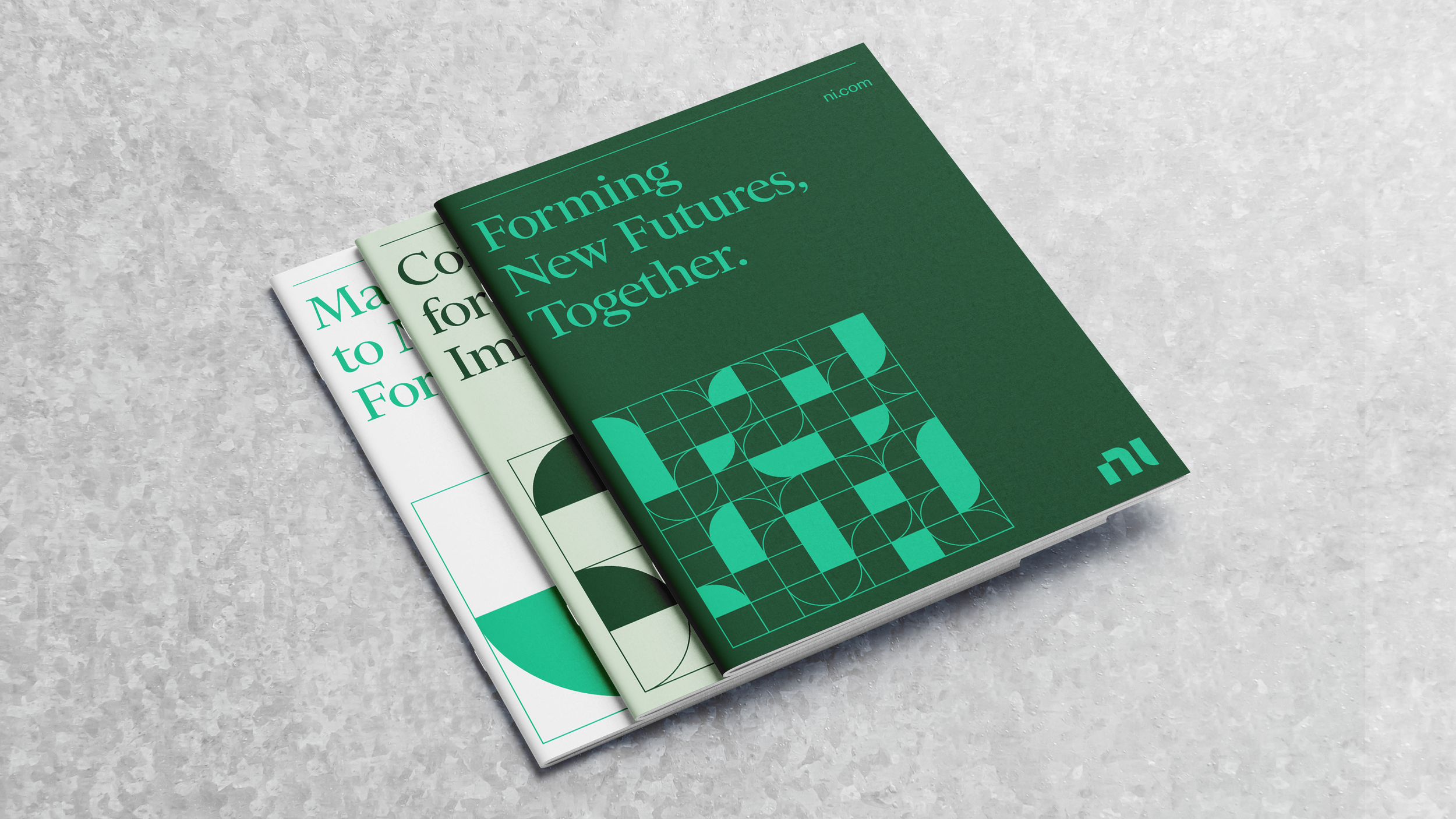
Each component of the identity system reflects the balance between technical precision and human ingenuity at the heart of NI.
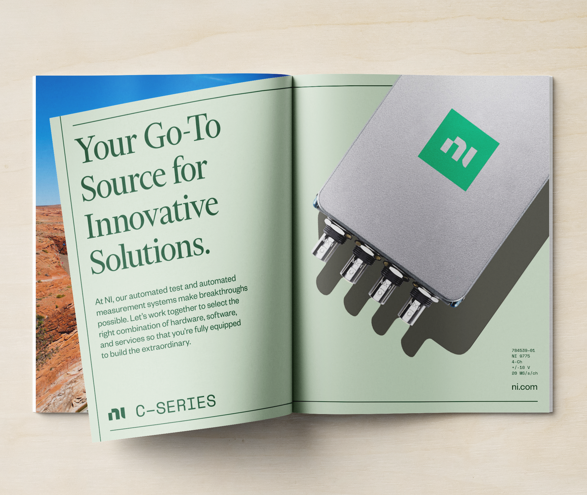
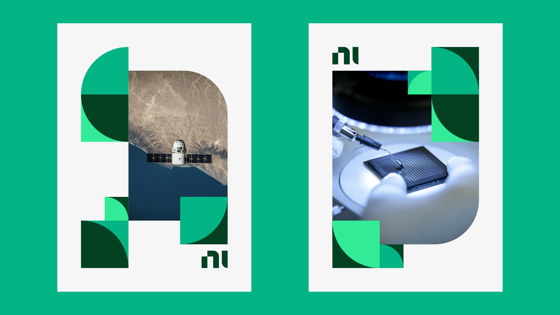
The elements work together through a modular system that allows the grid to flex depending on the message and content. In stark contrast to the category, the design language maintains an editorial feel, and photography plays a key role by featuring the people, partners and impact of the innovations powered by NI, not just the products.
PXI chassis, like all NI systems are modular– the flexible configuration integrates with custom hardware and software workflows
Web design and development by Organic.
Moving beyond the tropes and traditions of the B2B test and measurement category meant approaching the brand like a dynamic B2C.
Product design by MNML.
Aligning the product portfolio with renewed brand focus
–
NI has an extensive portfolio of software and hardware products, generally positioned as individual units. To create clarity for customers and align the portfolio with a new brand strategy, we organized the product offering around a systems-first architecture. Specifically, we highlighted the brand’s superior software capabilities which powers the connections behind the brand’s flexible, adaptive offerings.
Visual Brand Language book by MNML.
“The company utilized a balance of “hard and soft” elements in the design that seek to invoke the balance between rationality and creativity, hardware and software, and intellect and emotion that characterize the company’s strategy. It looks sharp and modern—I’m a fan.”
System
–
Logo
–
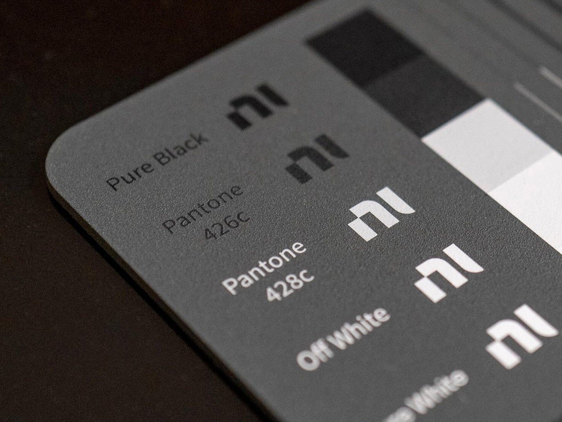
The mark reflects the connection of hard and soft, rationality and creativity, tech and people that sets NI apart.
The letterforms are modular, geometric and precise. Designed for scale, the mark works equally well in signage or circuit board applications.
Signage design and documentation by Asterisk.
“Before working with them, we had a very complex way of presenting ourselves to our customers and the market. [Gretel's] process helped us distill down to the most important and impactful part of what we do.”
Iconography +
Illustration
–
While photography plays a key role, concepts like autonomous driving, 5G communication and aerospace innovation can’t always be captured in imagery. Spot illustrations and icons are rendered in a distinctive, interconnected visual language derived from the logo.
Portrait illustrations of NI colleagues were commissioned as well, another extension of the blend between precision and personality at the heart of the brand.
Portraits by Aleksandar Savić.
Purpose as Tagline
–
We crafted a brand purpose calling on all innovators, from individuals to enterprises to Engineer Ambitiously. The higher-order purpose stands as a challenge to think bigger, aim higher, go faster. The brand’s expertise in connectivity and adaptability allows NI to answer that call for its customers.
Color
–
In a category oversaturated with safety blue and electric red, NI stands apart. The green signals a decisive new direction for the brand and evokes feelings of growth, change and sustainability, one of the grand challenges facing engineering today.
Typography
–
A suite of complementary typefaces extends the core brand idea of balancing precision and personality. Financier lends character to headlines and brand statements while Space Mono is used to call out technical specs, numerals and model numbers. Founders Grotesk is our workhorse sans, functional without sacrificing personality.


