Knoll
Modern always works
–
Launching the first
edition of Knoll Works
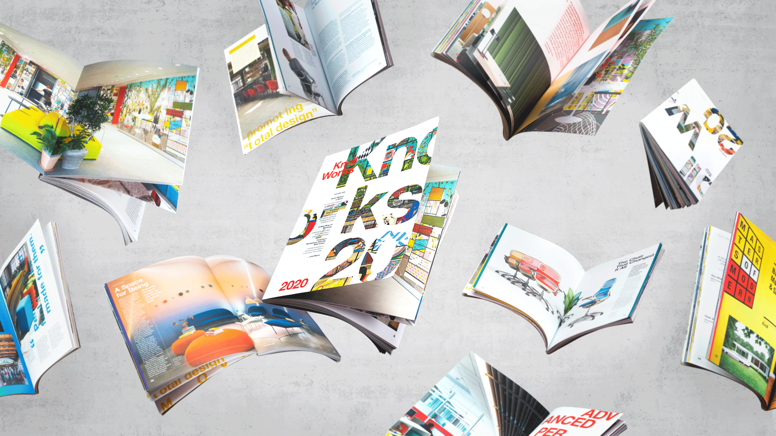
Long a pioneer in modern workplace design, Knoll wanted to launch an annual publication that blurred the lines between a magazine, a look-book and a catalog. We set out to create a publication that inspires designers while informing sellers and dealers. By featuring client collaborations, company milestones and designer profiles, the goal was to illustrate the breadth of Knoll’s expertise in planning and product solutions for the modern workplace.
The theme for the flagship 2020 issue was “change.” To bring it to life we focused on stories and scenarios where new and inspiring thinking was put into practice. This theme informs the whole of the editorial design, and is infused in both content and form.
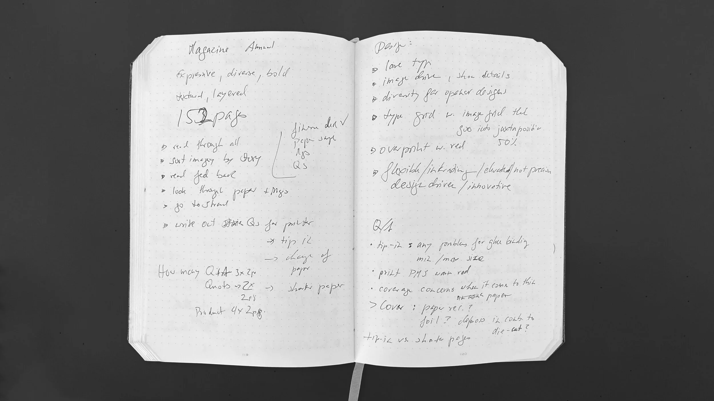
The editorial portion of the assignment meant working with Knoll to procure interviews, write and edit features, profiles and sidebars, source imagery and structure content.
Our editorial design builds on Knoll’s iconic color palette and modernist typography. For Knoll Works, we expanded the brand’s system to feel more expressive and dynamic: each story has a custom color palette, type treatment and layout logic to give readers a unique physical and visual experience.
“The result is a delightful fusion of high-end editorial design, strategic branding insight and technical detail.”
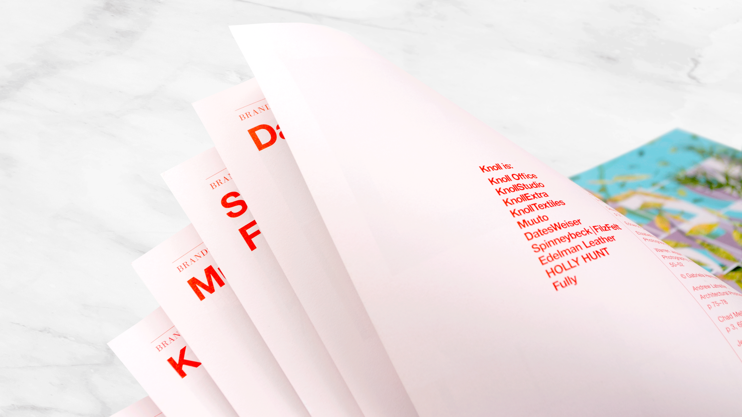
As readers move through the publication, the paper stock shifts from heavy white matte for feature stories, to thin color stocks for informational sections. The result is an adaptable graphic and editorial framework that lays the foundation for years to come.


